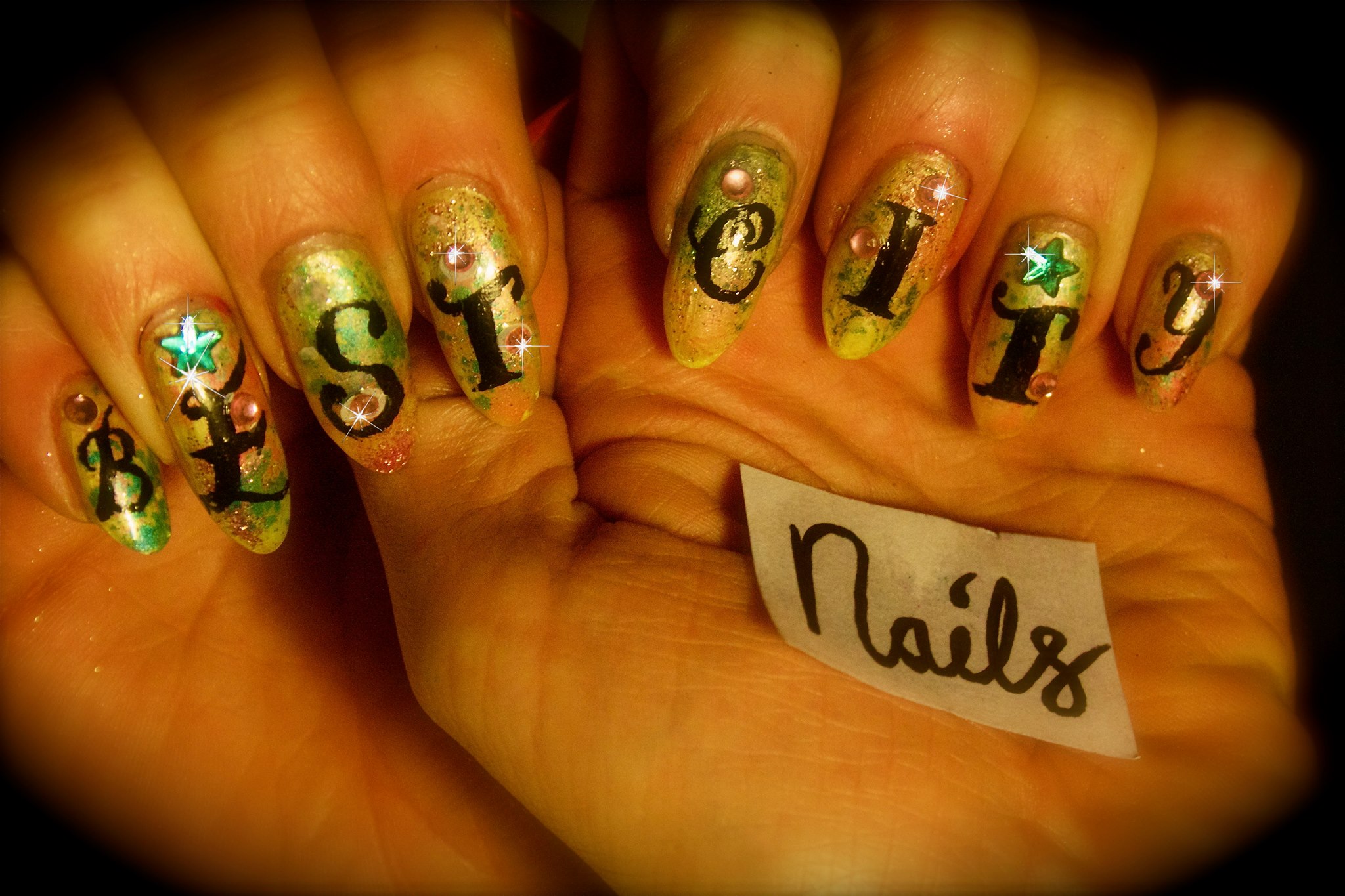
Week #26 – Best City Nails
From now on I will be making video tutorials on the amazing BEST CITY FASHION Youtube channel, so subscribe for amazing nail art techniques and lots of other wild, style and fashion videos!
Week #25 – WE’RE BACK…this time with Moomins (crack repair tutorial)
If anyone out there has been waiting the return of Best City Nails, the time has come. The ‘professional reasons’ for neglecting this fine art form are being IGNORED henceforth.
So, to mark our return here’s a tribute to my favourite kids’ TV show (and also to the orignal comics by Tove Jannson, a very inspirational woman). I loved the Moomins when I was little and I still do.
The Moomin Papa nail was seriously cracked and has been repaired using teabag paper and glue. I don’t think you can really tell so for details on how to do this, see below.
Click pics for HD.
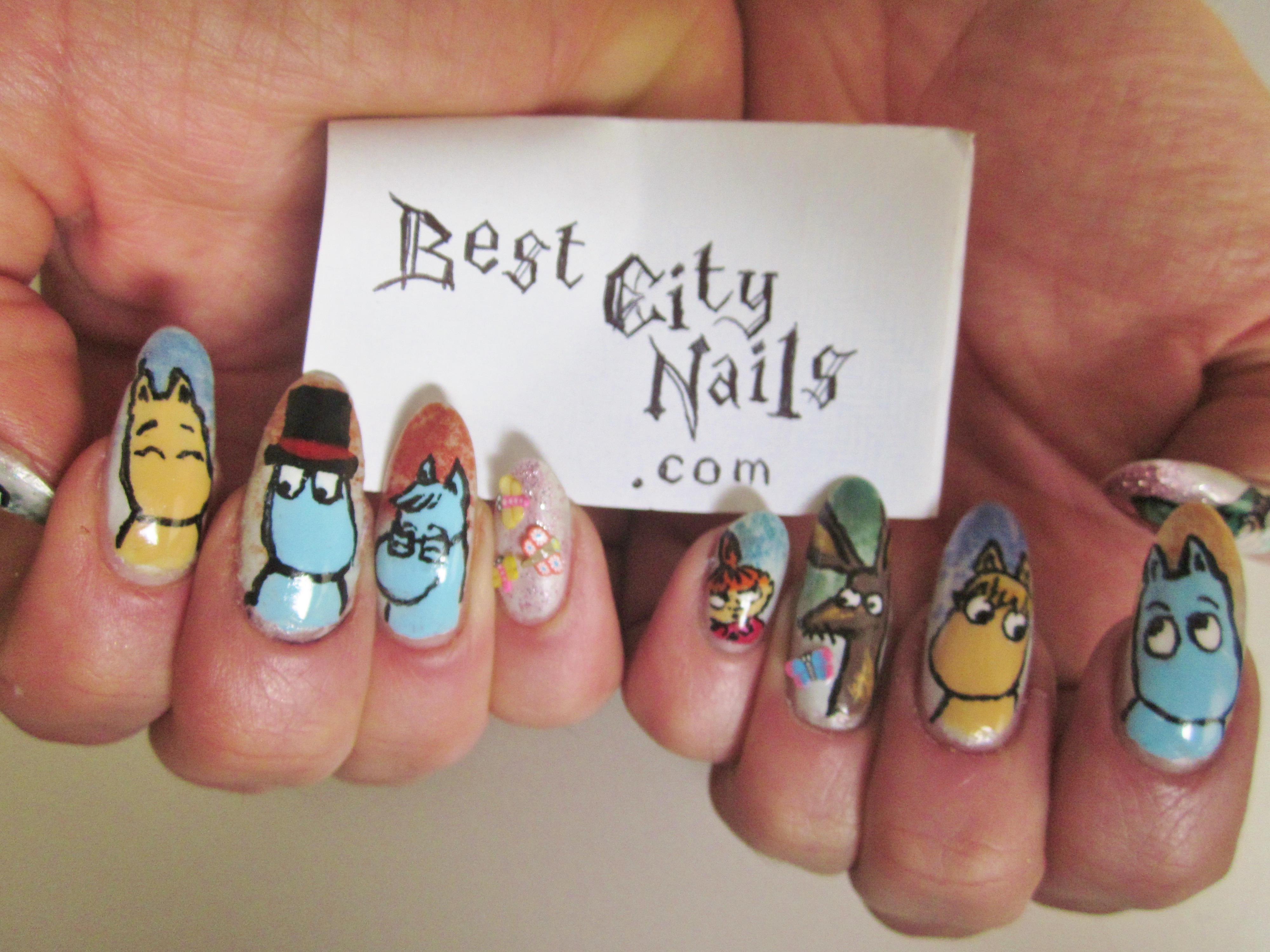
The usual techniques have been used: base colour of eggshell blue, Barry M loose eye shadow powder sprinkled on top of this, then the basic shapes and colours to build the characters and their clothes, then a layer of Seche Vite to dry, then black line details with a liquid eyeliner, finally another layer of Seche Vite and some 3D butterflies from the nail section in Poundland.
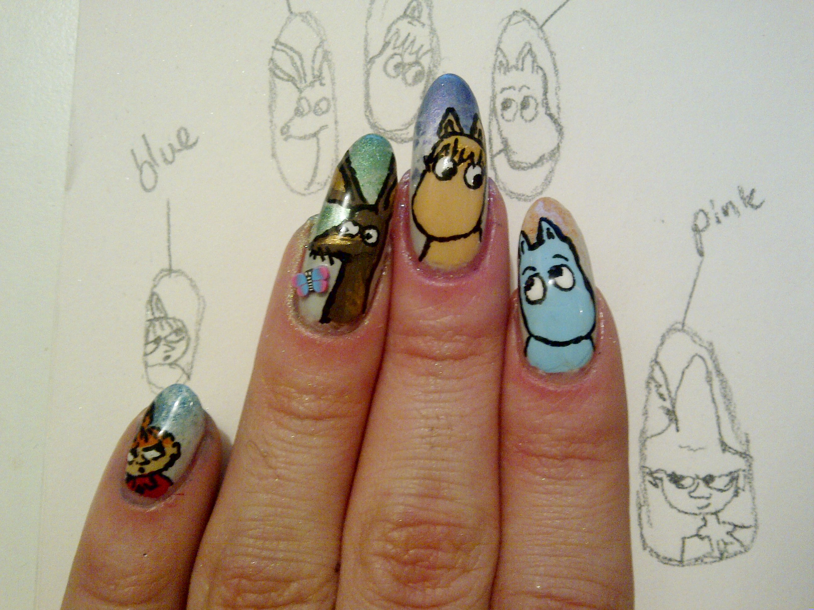
The design process!

Much more pleased with this hand; I like the way the characters are interacting with each other.

Snufkin and the Hemulen. You can see one of the butterfly 3Ds here. I do realise one nail is a lot shorter. Reminder that we’re working with REAL nails here. This thumb died before I came across the useful trick below.
REPAIRING CRACKED NAILS
The middle finger on the RIGHT hand sustained a serious crack. I decided not to let this get in the way of my nail art comeback and used this teabag trick to strengthen the nail.
Instead of nail glue I used superglue, and I didn’t bother with a base coat so I am not sure how easy it will be to change my nail polish! But life’s too short of base coats god damn it.
Although the tutorial below is 8 minutes long (it’s not me) once you watch it once you feel like you know what to do and it is easier and less fiddly than I imagined it might be.
Week #23 – 3Ds
More experimentation with pretty basic 3D techniques (Poundland crystals, in fact).
The main difficulty here is whether to top coat over the crystals. If you do, they stay on for weeks but they loose their sparkly-ness as the top coat smooths over all the facets. If you just glue the crystals to a finished nail and leave it at that, they might stay on for two or three days. YOUR CALL.

Above, crystals without top coat.

Above, with top coat over crystals.
The difference is far more pronounced than it appears in these shitty phone photos. Apologies for this also; temporarily lack decent photography solutions!
6.2/10
You know you’ve seen more exciting nails on this blog. It is what it is.
Week #22 – Eye of Horus

Today I have finally got round to two designs I have been thinking of for a while.
One is this rope/plait/chain type thing, which I have done on top of a Barry M ‘Instant Nail Effects’ cracked-effect colour.
The other is the Eye of Horus, an important symbol which I have borrowed from Egyptian myth. Eyes, triangles and motifs like this are zeitgeisty in nail art at the moment thanks to Sophy Robson. Also, Madonna at the Super Bowl and Rihanna at Hackney Weekend have both added an Ancient World flavour to their much-talked-about performances.
I have enhanced the eyes with nail art jewels from Poundland.

8/10
The second 8 in a row. These work well. Into the chains, but they probably would stand out more with a less messy background. Alternating black and white might be nice. It was also hard to draw the black outlines and detail on the chains after covering the wet gold paint with glitter, but these are the challenges we face in life.
You can see these nails in motion below:
Nail Fail #3
Well Best City Nails doesn’t like to bitch too much, and so it’s been a while since we’ve posted in our Nail Fail category.
But this frightful sight from Allegra Mostyn-Owen – an artist and Oxford graduate most notable for her 6-year marriage to London mayor Boris Johnson – has caught our attention in the pages of the Brave Boris Promotional Pamphlet, often referred to as the Evening Standard (article here).

Ms Mostyn-Owen appeared in an interview to explain how great and funny Boris Johnson is (cheers, but we all know he’s really funny…for many people this is considered his sole redeeming feature). She also explained how into Muslims she is, and how she knows loads about Muslims, and so Boris probably loves them as well. And how she and Boris had loads of fun at university sending notes to each other and drinking wine.
ALRIGHT ALLEGRA, well we’re ALL very anti-Islamaphobia and we ALL had fun at university drinking wine….doesn’t mean we need to go around proving our fun-loving and down-to-earth credentials with a maroon manicure and a chipped, black contrast nail. WHAT THE FUCK?!
What an aggressive, classless colour combination. I mean what is this? Apart from the family jewels, this could be the hand of a scruffy rebellious teenager, swigging cider and smoking weed in the park, listening to ska punk. Which is fine, in its place.
And these sorry-looking short nails are being done no favours dressed in such dark colours. Less Avril Lavigne and more Hilary Devey, pls.
The ‘I’m an artist and I am relaxed in my own home’ is fine if executed well, but chipped nails are no friend of this blog.
HERE IS THE DIVINE DEVEY DEMONSTRATING HOW TO DO AN INTERVIEW AND NAIL-ART PHOTO SHOOT IN YOUR HOME:

CAPISCE?! Devey’s subtle pose couldn’t be further from Allegra’s ‘LOOK AT ME! Look how A) rich B) ethnic-friendly and C) nail-art-retarded I am! ALL ON ONE CASUAL-YET-VERY-OBVIOUSLY-POSITIONED HAND!’
We have to give these an epic…
0/10
I mean, what’s to like? Miley’s nails got two marks for at least not being chipped – we can’t even afford such generosity here.
Sorry Allegra; newly-appointed Evening Standard Queen of the East London Muslims you may be (lol), but a nail queen you are not.
Week #20 – Nautical nails
Farewell, my lovely Nancy, for it’s now I must leave you,
All on the salt seas I am bound for to go;
But let my long absence be no trouble to you,
For I shall return in the spring, as you know…
This week we’re serving up some serious maritime realness!

Standard skull with crossed sword and bone, the desert island and sunset (a classic 90s nail motif) a ship, circled in rope over a parchmenty effect (white dappled with yellow powder) an anchor, and some merpeople!
So far the sunset proving by far the most popular (when fingers placed together it forms a whole island, like two pieces of a jigsaw – the merpeople compliment each other in a similar way).


I am proudest of the ship, though, as I thought that one could go very badly.
Skull and crossbones is black painted over a white background, oddly, just because I thought this would be easier.

[click on above image for mind-blowing HD]
9.8/10
You love it, we love it.
Goin this way, that way, forward and backwards, over the deep blue sea,
A bottle of rum to fill my tum and THAT’S THE LIFE FOR ME!
Nail Street Style #5
This is Chan. She is a hip young thing who we met in Topshop.

We had to get a picture of these dream talons, which a friend did for her.

Chan always has nails done so I asked her about phones and she said:
“I used to have a Blackberry but my nails were actually completely ruining the keys, so I have just changed to an iPhone and I hate it. I absolutely hate it! I’m like [mimes trying to use a touch screen with a really flat finger.]”
Well we all know about that, but who needs to be able to use a phone when your glittery, Chanel nails looks so sickening?!
Week #19 – HOW TO: Real pressed flowers

Just when you think you are running out of ideas of ways to pimp your directional nails: pressed flowers. We had this idea wondering the city streets and marvelling at all the spring blossom (most of which is gone now), but blossom from trees is, in the main, way too large to be pressed onto a nail.
Forget-me-nots, however are perfect! Directional! Editorial!
Step #1
Pick some of the flowers (respectfully!), then separate the flower itself as much as possible from the stem and bud so that it presses as flat as possible (this is much easier on the larger flowers, but we still used a couple of small ones for variety).
Step #2
Then find as big a book as you can and put the flowers between some sheets of kitchen paper in the book, and leave to one side with added weight on top if you like. A couple of days was fine for me.
Step #3
When the flowers are dry and flat, apply two coats of your background colour to the nail, wait a minute or so for it to dry slightly. Then use tweezers to place the flowers on the nail – take care not to dent the surface of the nail polish, and if you do perhaps it can be covered with a flower?
Step #4
Finally, to keep the flowers from escaping. apply a thick coat or two of a good top coat like Seche Vite.
Important Note!
Some of the flowers did gradually go brownish over time, but I would say they only became unacceptably brown around the time I needed to do my nails again anyway (i.e. at least a week) so I wouldn’t let this put you off.

The other nails are inspired by stained glass windows. The colour blocks are kind of like the glass, the and black lines are like the lead/resin-type-stuff that holds it together.
Also, we experimented further with eyes, after a successful – if slightly creepy – eye-based design in the past.
We guess the eye juxtaposed with the stained glass, and the actual flowers of God’s creation is kind of human wonderment at perception of the divine or something.
7.1/10
We like this and will probably be re-using all these techniques in new combinations in the future. The stained glass window nails could have been a little neater, however.
Celebrity Contrast Nails: Joan Rivers and Sharon Needles
Well, well, well this might just be the campest ‘Celebrity Contrast Nails’ post so far, with two inspirational figures from overseas recently championing the contrast cause.
Our previous heroes have included of course, Kelly Rowland, Serena Williams and Cher Lloyd.
Now obviously these days you can’t so much as get on the underground without spying a contrast nail nestling somewhere, BUT that doesn’t mean we shouldn’t keep our eyes peeled, as the gruesome saying goes, for the next big thing…

The next big thing for Joan Rivers seems to be the contrast nail being the ONLY pass-remarkable nail. Why paint ten when you can paint two? A thought-provoking look, and unquestionably a time-saving one. After all, this is a woman who constantly jokes about her proximity to death. We can see why she would opt for this.
4/10
We can’t score highly because at the end of the day, we all know this doesn’t pack much of a punch. But it makes sense. And if you’re only painting two nails, all the better that they be in this classy shade of blue which is both electric, but still dark enough to go with anything. She knows what she’s doing.

Now the VERY interesting case of Sharon Needles’s manicure. This is the man who is almost certainly about to win drag queen reality competition RuPaul’s Drag Race. Sharon seems to have taken inspiration from the pink, and black’n’white check that has long characterised the promotional shots and opening credits of the show. And, indeed, so did we. A long time ago.
Now we’re not saying Sharon has had a bit of a google and copied Best City Nails.
But stranger things have happened.
As we (very generously) awarded our own original RuPaul nails a slightly ridiculous 7/10 it seems only fair Sharon gets a solid
7.5/10
As she has swapped the pink and the check round, so the check is more dominant – as well as it being a finer design.
Just like Joan Rivers, Sharon has thought practically about this; unlike my experience over the past week or so of gong around with garish Easter nails, these colours will go with all the looks she has to do in the course of an episode without her nails ever looking unkempt. It’s a win/win (and she will probably win).
Our main criticism is that they could stand to be a fair bit longer, in case they need re-purposing as a weapon of self-defence against the poisonous, childish, boring, and slightly racist Phi Phi O’Hara.
THE SHADE OF IT ALL.
Week #18 – Springtime nails

For our Easter nails we have gone for two nails decorated with patterns inspired by ones you typically find on springtime confectionary packaging, some Easter bunnies, some daffodils, and a Christian cross in springtime colours, to remind us of the sacrifice of Christ.
I am constantly amazed by the triumphs and challenges nail art presents. You would think that the white rabbit or the daffodils would be, by some margin, the trickiest nails here, and yet these designs have produced strong results, and the straight-forward looking crosses are the wonky villains letting the team down.
Sorry, but I haven’t included any instruction or photos of different stages because there’s too many techniques involved when every nail is different.

Click on image for ludicrous HD.
9/10
We’re quite proud of how these have gone, and may have even gone for a rare 10/10 score if the crosses were a little neater but unfortunately we were hurried just as were finishing those two. Not 100% sold on the gold swirly fingers, either – I would never have done a design like this if it weren’t inspired by Easter eggs, and there is a brown to purple Powder Gradient which is not as visible as hoped.
But Best City Nails is not about perfection – it is about spirit.
May the true spirit of Easter be with you this weekend.
“And he saith unto them, Be not affrighted: Ye seek Jesus of Nazareth, which was crucified: he is risen; he is not here: behold the place where they laid him.” – Mark 16:6
Week #17 – My square-tip hell…
Oh hi there, welcome to Best City Nails, your one-stop shop for making the best of your bargain basement nail art products.
My last post featured Liv Fontaine‘s pink square-tips with gold and black, so we have attempted a tribute with Best City Nails stapes; glitter, contrast nail, and – more recently – masking tape.

Awarded a healthy
7.7/10
…the main things I have learnt from these nails is the powder gradient WITHIN a masking tape stripe, executed poorly on the right thumb (my actual right hand, but to the left of your vision) but really quite ok on the left contrast nail.
The glitter is not done justice in this well-lit close-up, but in normal life and particularly in the evening these clumps of glitter are a bit more dazzling, which accounts for a fair portion of the score.
Also very taken with lurid pink and greeny-yellow BUT are these nails a bit 2nd wave Nu Rave? And if so is that OK?
But by far the BIGGEST lesson I have learnt is
Square Tips are a Nightmare…
…for natural nails. Square-tip acrylics are one thing, and one day we might just have to go there.
But square-filed natural nails crack SO easily in comparison to their pointed/almond-shaped rivals. As in, the CORNERS (which you otherwise don’t have) snap off all the time, without you noticing, to leave a diagonal, literally like cutting the corner of a piece of paper. Which is very dispiriting if you wanted a row of ferocious fake-looking angles and have to gradually watch them chip into meaningless neither-here-nor-there shapes.
Also I am told, a lot sharper. Whatever.
We’ll soon be making the transition back.
Nail Street Style #4 – California Dreaming
So it isn’t street style in the strictest sense, but we thought we had to put up our dear friend, artist Liv Fontaine‘s first foray into the world of pro nails.
Liv, who is 22 and from Southhampton, sent this picture in all the way from San Francisco, and we can see why.- these nails are glorious, like fireworks across a pink sky, and certainly fit for a scandalous gutterslut Queen! YOU GOT SOME MONEY FO ME?!

Even though we’re trying to steer clear of the acrylics slippery slope, we’re pretty jealous of these.
Stay tuned for further thoughts on the very current – and I might add pretty controversial – topic of square tips.
Week #16 – Sticker Stencils
")
These were the first time I used some tips stencils I got for about 10p on eBay. When it was just the green with a white tip it looked way too Christmassy, so I had to add the blue, and then decided to do the black (some of which was just easier to do freehand).
Here is what some of the used stickers look like, stuck on my laptop.

I decided to set off the dominant stencilled nail with the blue ones (on top of which was applied dabs of pink Barry M powder, gold spots, and then a sort of drunken white leopard print).
")
6.4/10
I do feel the blue, pink and gold slightly floral nails go nicely with the stenciled ones.
The former are actually quite twee and look like they could be a print for an old woman’s shirt, whereas the others are quite sporty and tacky, which is a great contrast. However I am unhappy with the length, they are currently far too short. Plus let’s not lie they could be a fair deal more exciting.
A Feast for the Eyes: Nail Art Knuckle-Dusters.
You know when you never realise there’s something you *NEED* until you see it?
NAIL ART KNUCKLE-DUSTERS. Oh my goodness, yes.
Here’s some sickening nail jewellery inspired by our fave nail diva Kid Sister, by ‘contemporary art jeweller’ Islay Taylor.

How great are they?
You’d have to have your own nails good enough to match though. Otherwise it would be a bit like when really average-looking people think it’s a good idea to wonder about with Kate Moss (or similar) on their tops.

I mean what is this saying, really?
Anyway they don’t appear to be for sale but Islay if you want to sling some Best City Knuckle Dusters our way, we won’t put up a fight, and they sure would look better!
Here’s the glorious video where it all began:
Week #15 – Lion Queen

This week I was creating an eye-catching look for a music video. There is a powder gradient, with a zig-zag stripe and a text-focussed contrast nail. I am quite pleased with the ‘Lion Queen’ nails, having not attempted text before.
The inspiration for Lion Queen is the phrase ‘Lion King, Lion Queen’, which means a cross between ‘easy come, easy go’ and ‘swings and roundabouts’, expressing a jolly type of apathy.

Above you can see the white stripe painted over the yellow and red, and the blue details are starting to be filled in with a striping brush.
8/10
These nails look great in real life, and I love the crown, etc. I much prefer the yellow and red fade to the green and purple one, however (and I wouldn’t have changed except for the yellow was running out) – also the keen-eyed nail fans among you will have noted that the blue zig-zags on one hand look great, whereas the orange zig-zags on the other hand are less intricate, which is due to the orange pen being shit, and the blue pen being quite great.
Popstar Nails: The Del Rey Square Tips

THE LOOK
Throughout the Born to Die video Lana Del Rey features a very acrylic-looking square-tip, with a V-shaped red at the top, giving a conventional design a very slightly sinister edge. In luxurious attention to detail, the red tips are separated from the neutrally-coloured nail with a sliver of gold.

THE MEANING
As the video begins in an embrace (the couple’s relaxed, tender, NAKED pose perhaps suggesting post-coitus) you might be forgiven for interpreting Lana Del Rey’s crimson-tipped talons as bloodied claws, dug into the skin of her partner during the freakiest throws of intercourse. This would sit well with the passion/pain duality in the song’s lyrics, which draw more from themes of mental darkness and physical death than one usually sees in popular love songs.
I believe it was the Marquis De Sade who said “It is always by way of pain one arrives at pleasure,” Madonna who said “There’s a certain satisfaction / In a little bit of pain,” and Lady Gaga who put it “And when it comes to love, if it’s not rough it isn’t fun.” So there’s a keen Pop tradition of exploring the sexual pain/pleasure relationship.

But Del Rey is an artist people seem be taking very seriously. In her choice of nail art perhaps she is not investigating the dynamic of pain in sex, but the more fundamental one of life and death. The French have an idiom that describes the orgasm as ‘le petite mort’ – the little death, and it is easy to expand a savage, animal sexual encounter, involving pain and the expenditure of life force, into Death at one end of the equation and, of course, a possible conception of new life at the other. The ‘blood’ on Del Rey’s nails therefore can be seen to encapsulate the paradox of the song’s title Born to Die.
It is not only in life’s creation that we may see a painful element, but in its preservation, also. The 1849 Tennyson poem In Memoriam A.H.H. contains a phrase often cited in reference to the cruelty and violence we can read into the evolutionary preservation of life: “Nature, red in tooth and claw”.
In fact, Del Rey introduces the Evolution Vs Intelligent design debate in the very first verse classically asking: “Is it by mistake or design?”
But the shock of Del Rey’s death at the close of the video over-writes much of this speculation with a new layer. How has she died? Was she really ‘born to die’ as she herself suggests, if so perhaps the earlier blood on her nails is her own, and it foreshadows her death at her own hands. Perhaps she mauls and tears at herself in a fulfilment of her destiny, and a completion of the creative process. Who can say?

THE VERDICT
We may have liked to see Del Rey’s nails in the throne scene a little more extravagant, perhaps even aping the splendour in tigers or the flowers that surround her, and contrariwise maybe a second less high-concept, standard nail bar look for the car scene would befit better befit the wayward but somehow all-American runaway couple.
But maybe this wouldn’t allow for the all the business about exploring sex, violence and the harsh realities of nature, and we all know that is what nail art is really for.
Nice going, Lana.
8/10
See the nails in motion below:
Week #13 – Happy New Nails! Masking tape adventures…
Seems ridiculous, as masking tape is such a staple in the word of intermediate-level home-manicures, but this is our first foray into masking tape fun.

What do you call this look anyway? It’s not Cubism? Art deco? Geometric? Dunno what it is exactly but it’s lookin fressshhhhhhhhhhhhh

SOME TIPS: See that pink colour and that purple colour? They’re actually the same, but just with the black or white base showing through SO, maybe it would be better to start with all the nails the same colour to avoid unexpected variety and/or use good quality, thick-texture varnishes, not like me at CheapSkate City.
6.8/10
The nails look a lot better in the top photo which used a flash, and they look at lot better in real life, but I feel I can put the masking tape technique to better use, I feel the gold stripes are a bit too thick AND there are a couple of vexing imperfections (that terrible whisker of white on the index finger could easily be edited out, but these photos are all bona fide and honest so you can join me in my quest for excellence).
And DON’T FORGET I have added these new special buttons to make it easy for you all to TWEET, FACEBOOK AND TUMBLR Best City Nails. SHARE THIS SHIT.
Week #12 – Eyes on the Prize, Violet…
This week the nails involved a repeat of Week #11’s psychedelia, a glitter nail, a pattern a bit like the nets tangerines come in, half-moons, topical glitter use, and EYES.
Many of us are of course familiar with the eyeball manicure popularised by London’s WAH Nails:

Picture: WAH nails
Here, as you can see, the concept works well as the nails are, more or less, quite a round shape so each nail is a WHOLE round, bloodshot eyeball.
Well here at B’ City Nails we don’t have too much time for nails this short, and it didn’t take us long to realise this would look shite on us, like an eyeball on widescreen.
We ended up painting two eyes, and even the make-up around the eyes, too. This was quite a nice look, but may take some time to perfect.
I am buying better brushes and pens soon, also, so stay posted for some product-based posts cos it has got to the stage now where my cheap-o tools are holding me back!
ANYWAY here’s the new nails, eyes n’all.

Both thumb nails broke recently so their inclusion in the photo (although they were painted) would ruin life.
7/10
I feel I have been marking myself too generously recently, and 2012 is the Year of Brutality after all. Not good enough will simply not be good enough, this year! I have decided I can’t fault the design of this manicure, each nail works great with the next one, etc. But the execution is just a bit too wonky for higher marks, and I am not 100% committed to that green glitter half-moon, either.
Nail Street Style #3
We met our new fashion-foward friend Jasmine on the Ferry from England to Dublin and instantly fell for her look that expertly treads the line between cute and badass.
You won’t be completely Christmas gobsmacked to find that Jasmine – 18, from London – is a fashion student.

Jasmine’s paw-print nails in classic RuPaul Drag Race colours were clock-able from across the boat! As you can see, they complimented her creature hat, and there’s even some creatures on her ring. We’re particularly keen on the index finger nail.

My friends at a Christmas party last night described Jasmine as a ‘cool lady’. I feel this probably is what has enabled her to carry off Dr Dre headphones without looking like a massive poser.
Week #11 – Accidently Hippy

The Contrast Nail here has ended up looking like a print for the harem trouser fabric of some sort of yogurt-plaiting, yoga Mum but in a way this works because the rest of the nails are kind of psychedelic, so they represent her acid-dropping, trip-hopping, mind-bending, festival-attending youth, and the contrast is her mellowed-out maturity.
She lives in Totness, Devon.
This set, then, represents age and the sands of time, and the processes we all go through on our winding way to the boneyard.
HERE’S HOW WE ACHIEVED THE LOOK…
Step #1

Begin with the Powder Gradient – this is gold with a bright pink Barry M powder. The powder this time is at the nail tip rather than the bottom, which calls for a slightly different technique and is a bit messier (don’t do this in bed). DON’T FORGET TO LEAVE OUT YOUR CONTRAST NAIL if you want to do one.
Step #2

Using a nail art pen, a striping brush or a liquid eyeliner, draw a ‘splat’ shape in the centre of the nail, then draw a thin stripe around the shape paying attention to emphasise the bumps and curves. Simply repeat outwards with increasingly thick stripes.
Apply a thick top coat (if you have used eyeliner, you may have to do this a bit softly to avoid flaking)
8.4/10
Losing marks for it’s slightly awkward hippy-dippyness, but overall a lot of fun and have proven popular over the week. Peace and Love, as always.
Week #9 – Back in Business
SHE GETS WHAT SHE WANTS.
This week’s are the sickest yet!
This is a great time to say how happy I am to be sharing my progress developing as a nail painter with you. We’re nearly up to 4,000 views on this blog, so subscribe, stay updated and keep ’em coming because my nails are only gonna get better.
Sorry for no details on products or technique, but it would be too long a post with each nail different.
Yes, yes, these are still far from perfect and maybe a little ‘derivative’, but I feel I have put my own spin even on the god-damn leopard.
PRAISE JESUS AND BEHOLD…

10/10
Obviously
Week #8 – Trip to Dalston
So I visited Pak’s Cosmetics in Dalston where you won’t pay more than £1.50 for a nail colour.
The quality is very thin so it is yet another of these 4-coat situations, but sometimes you can’t argue with spending £1 instead of £10. It’s up to you. Lion King, Lion Queen, as they say.
WHAT WE USED:

L-R:
Beauty Forever – 30
Beauty Forever – 49A
Beauty Forever – 130
No 7 ‘Stay Perfect’ in Betty Blue (so blue it’s actually black after one layer)
Standard cheap as chips eBay striping brush.

7.5/10
I didn’t feel as though this contrast nail really worked well with the rest. It was a clash…not enough to be gaudy and satisfying, but enough to slightly irk.
Was very into the custard / skin colour, though. Hope to put to better use in future.
The glittery polish was so gloopy and thick it took an age to dry. About two weeks later there is still no sign of chipping to these nails, so they have been incorporated into the next look.
More X Factor Nails
So judges’ houses (yeah, I should have got this up sooner but life as a bootleg nail diva is busy and hard)
…judges’ houses provided a little more nail intrigue for the show.
First up, 16-year-old Amelia Lily, who is now out of the show, displayed this mixed-colour manicure while she was weeping about the fact that her Dad loves her.

7/10
Why be harsh? The poor girl’s already been kicked off the show. Usually we find red and black combinations a little Dennis the Menace, and rather angry-looking, but maybe a little more anger is what’s needed these days. It goes nicely with her spooky, gothic jewelery and the nails themselves are very elegantly shaped.
Well done Amelia.

5/10
Mischa ‘B’ (Eugh – Jessie J, Katy B…give up, Mischa!) showed us all this baffling look while she was weeping about the fact that Jennifer Hudson came and stood by a swimming pool.
Not being funny but anyone will just look at an index finger nail, twice as long as the rest, and they’ll all be thinking it is for sniffing coke or picking your ears, etc.
Contrast COLOURS are fun, and look pointless. Contrast LENGTHS look as though there is some nefarious practical purpose. Contrast colours look frivolous and fun, and we’ve all just about gotten used to them now. Will be a long time before contrast length (and only on one hand, too) stops looking creeeeeeeeeeepy.
Why do you need that claw, Mischa?
This week, of course, Tulisa has outed Mischa as a cruel bully. Perhaps that single red bead on the offending nail is a symbolic drop of blood, squeezed from a puncture in the lungs of one of her fellow competitors.
If so, that is quite badass, and it is this potentially ferocious little red dot that saves Mischa from a much lower score.
Nail Street Style #2
We met Rachael at Waterloo station a few weeks back.
She sports a new trend we’re noticing more and more in nail art – the ‘contrast finger’.
At first we thought it might just be a coincidence, but we saw it about 3 more times and realised it is for sure a trend.
Stay tuned for our own interpretation of the ‘contrast finger’ (nearly always the ring finger, it seems)

Rachael is 16 and a college student. She told us she gets her nails done in Peckham, because it’s cheap and ‘that’s what everyone does.’

Rachael’s ‘contrast finger’ has stirred some controversy amongst the people she asked, many remarking that it ‘looks like a mistake,’ and even exclaiming ‘what is she doing?!’
But we love it; it makes you look twice, and we feel as long as both hands match, it looks quite deliberate.
…edgy!
