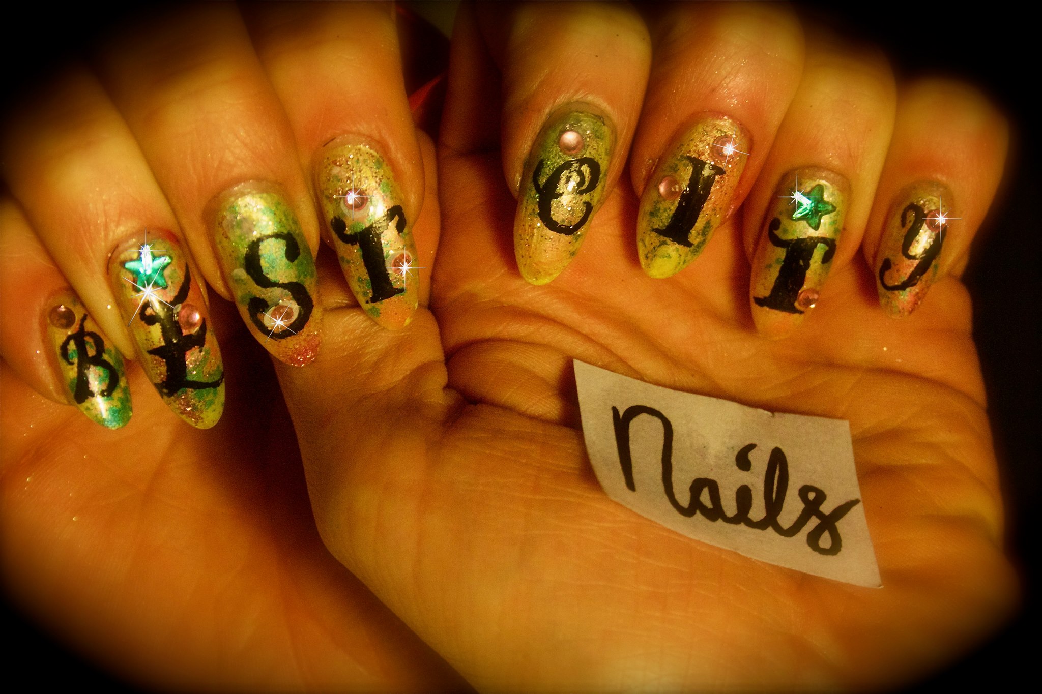
Week #26 – Best City Nails
From now on I will be making video tutorials on the amazing BEST CITY FASHION Youtube channel, so subscribe for amazing nail art techniques and lots of other wild, style and fashion videos!
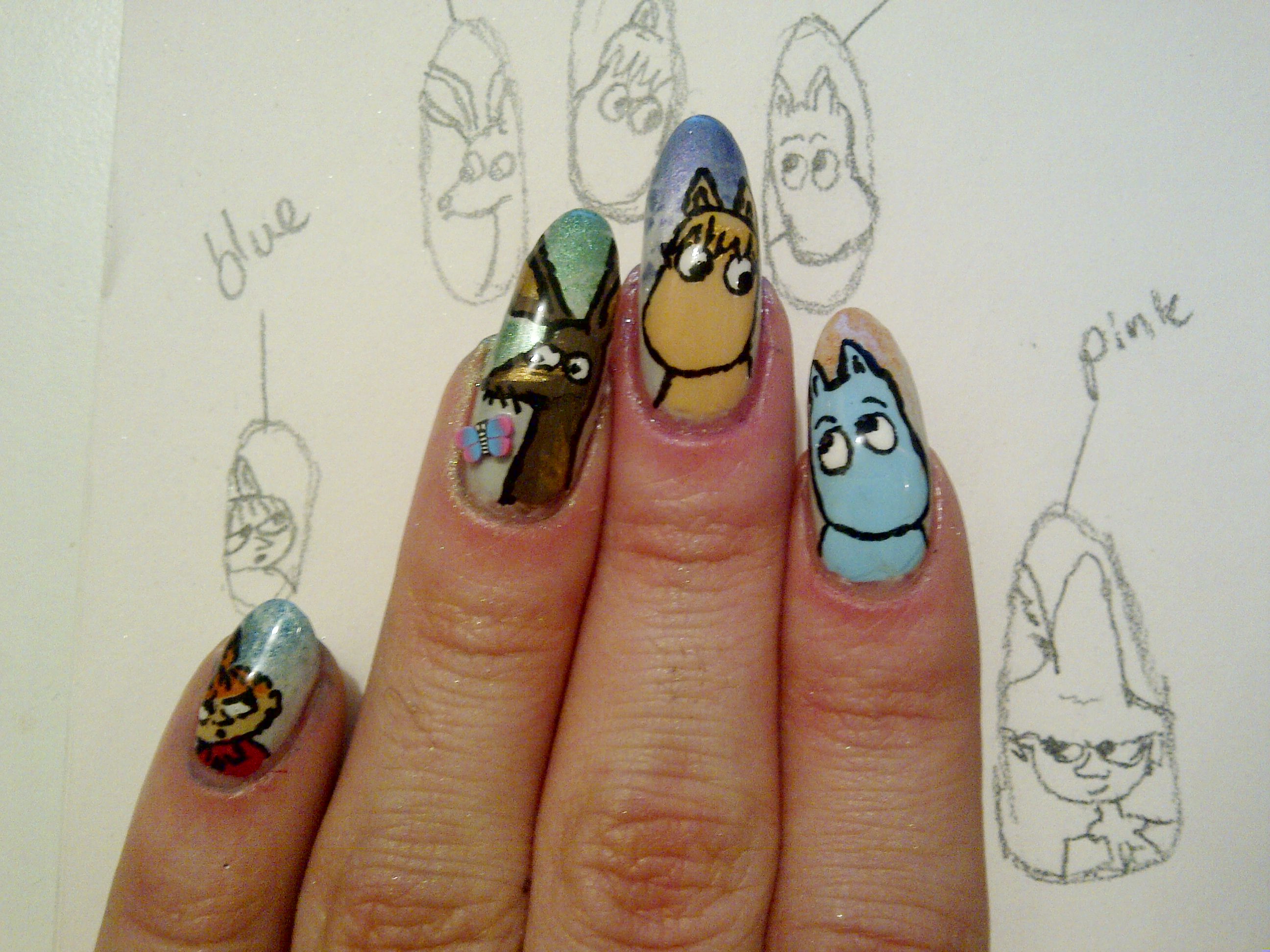
Week #25 – WE’RE BACK…this time with Moomins (crack repair tutorial)
If anyone out there has been waiting the return of Best City Nails, the time has come. The ‘professional reasons’ for neglecting this fine art form are being IGNORED henceforth.
So, to mark our return here’s a tribute to my favourite kids’ TV show (and also to the orignal comics by Tove Jannson, a very inspirational woman). I loved the Moomins when I was little and I still do.
The Moomin Papa nail was seriously cracked and has been repaired using teabag paper and glue. I don’t think you can really tell so for details on how to do this, see below.
Click pics for HD.
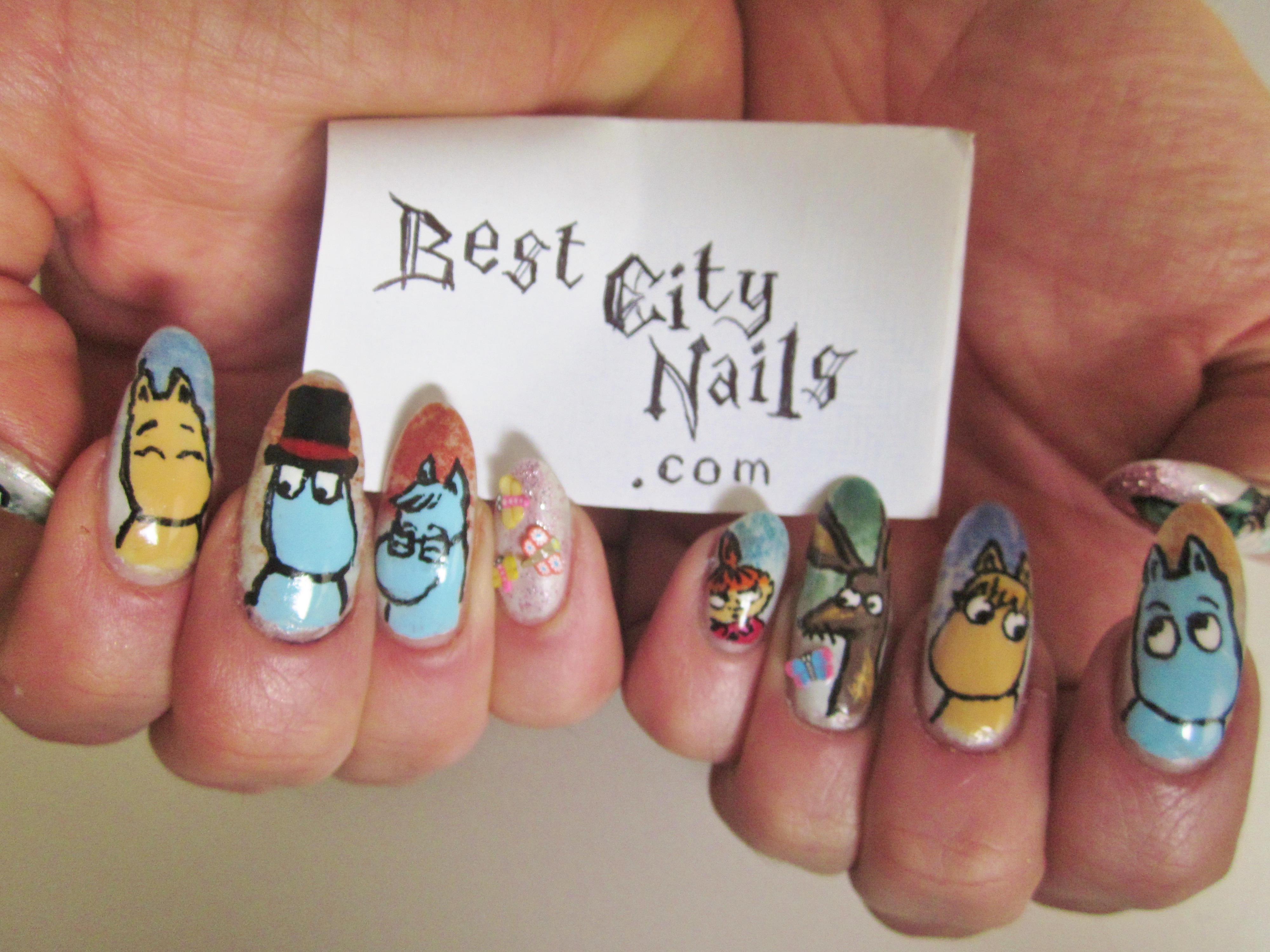
The usual techniques have been used: base colour of eggshell blue, Barry M loose eye shadow powder sprinkled on top of this, then the basic shapes and colours to build the characters and their clothes, then a layer of Seche Vite to dry, then black line details with a liquid eyeliner, finally another layer of Seche Vite and some 3D butterflies from the nail section in Poundland.
The design process!

Much more pleased with this hand; I like the way the characters are interacting with each other.

Snufkin and the Hemulen. You can see one of the butterfly 3Ds here. I do realise one nail is a lot shorter. Reminder that we’re working with REAL nails here. This thumb died before I came across the useful trick below.
REPAIRING CRACKED NAILS
The middle finger on the RIGHT hand sustained a serious crack. I decided not to let this get in the way of my nail art comeback and used this teabag trick to strengthen the nail.
Instead of nail glue I used superglue, and I didn’t bother with a base coat so I am not sure how easy it will be to change my nail polish! But life’s too short of base coats god damn it.
Although the tutorial below is 8 minutes long (it’s not me) once you watch it once you feel like you know what to do and it is easier and less fiddly than I imagined it might be.
We’re on haitus, but also EXPANDING
Those loyal to City Nails will have noticed a definite slowing in the number of posts.
This is because I cannot have long nails at the moment for work reasons.
I will try to continue posting street style, etc and responding to nail inquiries, however I will not be posting pictures of my own nails until I am able to grow them again.
HOPEFULLY THIS WILL BE SOON!
In the meantime please enjoy the first teaser of a new video project between me and some friends, BEST CITY FASHION!
Big Love,
Best City Nails.
Week #23 – 3Ds
More experimentation with pretty basic 3D techniques (Poundland crystals, in fact).
The main difficulty here is whether to top coat over the crystals. If you do, they stay on for weeks but they loose their sparkly-ness as the top coat smooths over all the facets. If you just glue the crystals to a finished nail and leave it at that, they might stay on for two or three days. YOUR CALL.

Above, crystals without top coat.

Above, with top coat over crystals.
The difference is far more pronounced than it appears in these shitty phone photos. Apologies for this also; temporarily lack decent photography solutions!
6.2/10
You know you’ve seen more exciting nails on this blog. It is what it is.
Week #19 – HOW TO: Real pressed flowers

Just when you think you are running out of ideas of ways to pimp your directional nails: pressed flowers. We had this idea wondering the city streets and marvelling at all the spring blossom (most of which is gone now), but blossom from trees is, in the main, way too large to be pressed onto a nail.
Forget-me-nots, however are perfect! Directional! Editorial!
Step #1
Pick some of the flowers (respectfully!), then separate the flower itself as much as possible from the stem and bud so that it presses as flat as possible (this is much easier on the larger flowers, but we still used a couple of small ones for variety).
Step #2
Then find as big a book as you can and put the flowers between some sheets of kitchen paper in the book, and leave to one side with added weight on top if you like. A couple of days was fine for me.
Step #3
When the flowers are dry and flat, apply two coats of your background colour to the nail, wait a minute or so for it to dry slightly. Then use tweezers to place the flowers on the nail – take care not to dent the surface of the nail polish, and if you do perhaps it can be covered with a flower?
Step #4
Finally, to keep the flowers from escaping. apply a thick coat or two of a good top coat like Seche Vite.
Important Note!
Some of the flowers did gradually go brownish over time, but I would say they only became unacceptably brown around the time I needed to do my nails again anyway (i.e. at least a week) so I wouldn’t let this put you off.

The other nails are inspired by stained glass windows. The colour blocks are kind of like the glass, the and black lines are like the lead/resin-type-stuff that holds it together.
Also, we experimented further with eyes, after a successful – if slightly creepy – eye-based design in the past.
We guess the eye juxtaposed with the stained glass, and the actual flowers of God’s creation is kind of human wonderment at perception of the divine or something.
7.1/10
We like this and will probably be re-using all these techniques in new combinations in the future. The stained glass window nails could have been a little neater, however.
Celebrity Contrast Nails: Joan Rivers and Sharon Needles
Well, well, well this might just be the campest ‘Celebrity Contrast Nails’ post so far, with two inspirational figures from overseas recently championing the contrast cause.
Our previous heroes have included of course, Kelly Rowland, Serena Williams and Cher Lloyd.
Now obviously these days you can’t so much as get on the underground without spying a contrast nail nestling somewhere, BUT that doesn’t mean we shouldn’t keep our eyes peeled, as the gruesome saying goes, for the next big thing…

The next big thing for Joan Rivers seems to be the contrast nail being the ONLY pass-remarkable nail. Why paint ten when you can paint two? A thought-provoking look, and unquestionably a time-saving one. After all, this is a woman who constantly jokes about her proximity to death. We can see why she would opt for this.
4/10
We can’t score highly because at the end of the day, we all know this doesn’t pack much of a punch. But it makes sense. And if you’re only painting two nails, all the better that they be in this classy shade of blue which is both electric, but still dark enough to go with anything. She knows what she’s doing.

Now the VERY interesting case of Sharon Needles’s manicure. This is the man who is almost certainly about to win drag queen reality competition RuPaul’s Drag Race. Sharon seems to have taken inspiration from the pink, and black’n’white check that has long characterised the promotional shots and opening credits of the show. And, indeed, so did we. A long time ago.
Now we’re not saying Sharon has had a bit of a google and copied Best City Nails.
But stranger things have happened.
As we (very generously) awarded our own original RuPaul nails a slightly ridiculous 7/10 it seems only fair Sharon gets a solid
7.5/10
As she has swapped the pink and the check round, so the check is more dominant – as well as it being a finer design.
Just like Joan Rivers, Sharon has thought practically about this; unlike my experience over the past week or so of gong around with garish Easter nails, these colours will go with all the looks she has to do in the course of an episode without her nails ever looking unkempt. It’s a win/win (and she will probably win).
Our main criticism is that they could stand to be a fair bit longer, in case they need re-purposing as a weapon of self-defence against the poisonous, childish, boring, and slightly racist Phi Phi O’Hara.
THE SHADE OF IT ALL.
Week #18 – Springtime nails

For our Easter nails we have gone for two nails decorated with patterns inspired by ones you typically find on springtime confectionary packaging, some Easter bunnies, some daffodils, and a Christian cross in springtime colours, to remind us of the sacrifice of Christ.
I am constantly amazed by the triumphs and challenges nail art presents. You would think that the white rabbit or the daffodils would be, by some margin, the trickiest nails here, and yet these designs have produced strong results, and the straight-forward looking crosses are the wonky villains letting the team down.
Sorry, but I haven’t included any instruction or photos of different stages because there’s too many techniques involved when every nail is different.

Click on image for ludicrous HD.
9/10
We’re quite proud of how these have gone, and may have even gone for a rare 10/10 score if the crosses were a little neater but unfortunately we were hurried just as were finishing those two. Not 100% sold on the gold swirly fingers, either – I would never have done a design like this if it weren’t inspired by Easter eggs, and there is a brown to purple Powder Gradient which is not as visible as hoped.
But Best City Nails is not about perfection – it is about spirit.
May the true spirit of Easter be with you this weekend.
“And he saith unto them, Be not affrighted: Ye seek Jesus of Nazareth, which was crucified: he is risen; he is not here: behold the place where they laid him.” – Mark 16:6
Week #17 – My square-tip hell…
Oh hi there, welcome to Best City Nails, your one-stop shop for making the best of your bargain basement nail art products.
My last post featured Liv Fontaine‘s pink square-tips with gold and black, so we have attempted a tribute with Best City Nails stapes; glitter, contrast nail, and – more recently – masking tape.

Awarded a healthy
7.7/10
…the main things I have learnt from these nails is the powder gradient WITHIN a masking tape stripe, executed poorly on the right thumb (my actual right hand, but to the left of your vision) but really quite ok on the left contrast nail.
The glitter is not done justice in this well-lit close-up, but in normal life and particularly in the evening these clumps of glitter are a bit more dazzling, which accounts for a fair portion of the score.
Also very taken with lurid pink and greeny-yellow BUT are these nails a bit 2nd wave Nu Rave? And if so is that OK?
But by far the BIGGEST lesson I have learnt is
Square Tips are a Nightmare…
…for natural nails. Square-tip acrylics are one thing, and one day we might just have to go there.
But square-filed natural nails crack SO easily in comparison to their pointed/almond-shaped rivals. As in, the CORNERS (which you otherwise don’t have) snap off all the time, without you noticing, to leave a diagonal, literally like cutting the corner of a piece of paper. Which is very dispiriting if you wanted a row of ferocious fake-looking angles and have to gradually watch them chip into meaningless neither-here-nor-there shapes.
Also I am told, a lot sharper. Whatever.
We’ll soon be making the transition back.
A Feast for the Eyes: Nail Art Knuckle-Dusters.
You know when you never realise there’s something you *NEED* until you see it?
NAIL ART KNUCKLE-DUSTERS. Oh my goodness, yes.
Here’s some sickening nail jewellery inspired by our fave nail diva Kid Sister, by ‘contemporary art jeweller’ Islay Taylor.

How great are they?
You’d have to have your own nails good enough to match though. Otherwise it would be a bit like when really average-looking people think it’s a good idea to wonder about with Kate Moss (or similar) on their tops.

I mean what is this saying, really?
Anyway they don’t appear to be for sale but Islay if you want to sling some Best City Knuckle Dusters our way, we won’t put up a fight, and they sure would look better!
Here’s the glorious video where it all began:
Week #15 – Lion Queen

This week I was creating an eye-catching look for a music video. There is a powder gradient, with a zig-zag stripe and a text-focussed contrast nail. I am quite pleased with the ‘Lion Queen’ nails, having not attempted text before.
The inspiration for Lion Queen is the phrase ‘Lion King, Lion Queen’, which means a cross between ‘easy come, easy go’ and ‘swings and roundabouts’, expressing a jolly type of apathy.

Above you can see the white stripe painted over the yellow and red, and the blue details are starting to be filled in with a striping brush.
8/10
These nails look great in real life, and I love the crown, etc. I much prefer the yellow and red fade to the green and purple one, however (and I wouldn’t have changed except for the yellow was running out) – also the keen-eyed nail fans among you will have noted that the blue zig-zags on one hand look great, whereas the orange zig-zags on the other hand are less intricate, which is due to the orange pen being shit, and the blue pen being quite great.
Week #13 – Happy New Nails! Masking tape adventures…
Seems ridiculous, as masking tape is such a staple in the word of intermediate-level home-manicures, but this is our first foray into masking tape fun.

What do you call this look anyway? It’s not Cubism? Art deco? Geometric? Dunno what it is exactly but it’s lookin fressshhhhhhhhhhhhh

SOME TIPS: See that pink colour and that purple colour? They’re actually the same, but just with the black or white base showing through SO, maybe it would be better to start with all the nails the same colour to avoid unexpected variety and/or use good quality, thick-texture varnishes, not like me at CheapSkate City.
6.8/10
The nails look a lot better in the top photo which used a flash, and they look at lot better in real life, but I feel I can put the masking tape technique to better use, I feel the gold stripes are a bit too thick AND there are a couple of vexing imperfections (that terrible whisker of white on the index finger could easily be edited out, but these photos are all bona fide and honest so you can join me in my quest for excellence).
And DON’T FORGET I have added these new special buttons to make it easy for you all to TWEET, FACEBOOK AND TUMBLR Best City Nails. SHARE THIS SHIT.
Week #12 – Eyes on the Prize, Violet…
This week the nails involved a repeat of Week #11’s psychedelia, a glitter nail, a pattern a bit like the nets tangerines come in, half-moons, topical glitter use, and EYES.
Many of us are of course familiar with the eyeball manicure popularised by London’s WAH Nails:

Picture: WAH nails
Here, as you can see, the concept works well as the nails are, more or less, quite a round shape so each nail is a WHOLE round, bloodshot eyeball.
Well here at B’ City Nails we don’t have too much time for nails this short, and it didn’t take us long to realise this would look shite on us, like an eyeball on widescreen.
We ended up painting two eyes, and even the make-up around the eyes, too. This was quite a nice look, but may take some time to perfect.
I am buying better brushes and pens soon, also, so stay posted for some product-based posts cos it has got to the stage now where my cheap-o tools are holding me back!
ANYWAY here’s the new nails, eyes n’all.

Both thumb nails broke recently so their inclusion in the photo (although they were painted) would ruin life.
7/10
I feel I have been marking myself too generously recently, and 2012 is the Year of Brutality after all. Not good enough will simply not be good enough, this year! I have decided I can’t fault the design of this manicure, each nail works great with the next one, etc. But the execution is just a bit too wonky for higher marks, and I am not 100% committed to that green glitter half-moon, either.
Nail Street Style #3
We met our new fashion-foward friend Jasmine on the Ferry from England to Dublin and instantly fell for her look that expertly treads the line between cute and badass.
You won’t be completely Christmas gobsmacked to find that Jasmine – 18, from London – is a fashion student.

Jasmine’s paw-print nails in classic RuPaul Drag Race colours were clock-able from across the boat! As you can see, they complimented her creature hat, and there’s even some creatures on her ring. We’re particularly keen on the index finger nail.

My friends at a Christmas party last night described Jasmine as a ‘cool lady’. I feel this probably is what has enabled her to carry off Dr Dre headphones without looking like a massive poser.
Week #11 – Accidently Hippy

The Contrast Nail here has ended up looking like a print for the harem trouser fabric of some sort of yogurt-plaiting, yoga Mum but in a way this works because the rest of the nails are kind of psychedelic, so they represent her acid-dropping, trip-hopping, mind-bending, festival-attending youth, and the contrast is her mellowed-out maturity.
She lives in Totness, Devon.
This set, then, represents age and the sands of time, and the processes we all go through on our winding way to the boneyard.
HERE’S HOW WE ACHIEVED THE LOOK…
Step #1

Begin with the Powder Gradient – this is gold with a bright pink Barry M powder. The powder this time is at the nail tip rather than the bottom, which calls for a slightly different technique and is a bit messier (don’t do this in bed). DON’T FORGET TO LEAVE OUT YOUR CONTRAST NAIL if you want to do one.
Step #2

Using a nail art pen, a striping brush or a liquid eyeliner, draw a ‘splat’ shape in the centre of the nail, then draw a thin stripe around the shape paying attention to emphasise the bumps and curves. Simply repeat outwards with increasingly thick stripes.
Apply a thick top coat (if you have used eyeliner, you may have to do this a bit softly to avoid flaking)
8.4/10
Losing marks for it’s slightly awkward hippy-dippyness, but overall a lot of fun and have proven popular over the week. Peace and Love, as always.
Nail Fail #2
Been a long while since we’ve drawn attention to a Nail Fail, especially as we are all trying to be positive in these dark, dark times.
But this time we aren’t picking on Miley ‘She’s-Just-Being-Miley’ Cyrus…it’s our own fail. Best City Nail Fail. An own goal, if you will.
Because we thought OBVIOUSLY you can just stick bits of magazines to your nails…

3/10
The only marks here are for effort.
It didn’t look good from a distance, just murky, fleshy colours. Up close, as you can see, was even more of a nightmare and that was before everything began to peel, and water began to seep beneath the paper.
For those who can’t tear their eyes away this is L-R: Kelly Rowland, Britney Spears, Katie Price, Gwen Stefani and Kerry Katona. Selected from an old issue of Closer magazine solely on the basis of their being about the right size (although if it could be done well, a whole set of the Stefani eyes might be nice, after all she is a Nail Queen!)
Week #10 – Powder Gradient, Whisker Tip, Fresh Colours
This ‘week’ we tried various ways to make Rimmel’s ‘I ❤ Lasting Finish’ in 280 Sunshine work.
After a pretty uninspired attempt at a smiley face motif we settled for this jazzy little arrangement. Although it’s not the most exciting design-wise, the colours catch the eye and the whisker-thin tip emphasises the nail’s shape.

8/10
Most refreshing.
Week #9 – Back in Business
SHE GETS WHAT SHE WANTS.
This week’s are the sickest yet!
This is a great time to say how happy I am to be sharing my progress developing as a nail painter with you. We’re nearly up to 4,000 views on this blog, so subscribe, stay updated and keep ’em coming because my nails are only gonna get better.
Sorry for no details on products or technique, but it would be too long a post with each nail different.
Yes, yes, these are still far from perfect and maybe a little ‘derivative’, but I feel I have put my own spin even on the god-damn leopard.
PRAISE JESUS AND BEHOLD…

10/10
Obviously
Week #8 – Trip to Dalston
So I visited Pak’s Cosmetics in Dalston where you won’t pay more than £1.50 for a nail colour.
The quality is very thin so it is yet another of these 4-coat situations, but sometimes you can’t argue with spending £1 instead of £10. It’s up to you. Lion King, Lion Queen, as they say.
WHAT WE USED:

L-R:
Beauty Forever – 30
Beauty Forever – 49A
Beauty Forever – 130
No 7 ‘Stay Perfect’ in Betty Blue (so blue it’s actually black after one layer)
Standard cheap as chips eBay striping brush.

7.5/10
I didn’t feel as though this contrast nail really worked well with the rest. It was a clash…not enough to be gaudy and satisfying, but enough to slightly irk.
Was very into the custard / skin colour, though. Hope to put to better use in future.
The glittery polish was so gloopy and thick it took an age to dry. About two weeks later there is still no sign of chipping to these nails, so they have been incorporated into the next look.
More X Factor Nails
So judges’ houses (yeah, I should have got this up sooner but life as a bootleg nail diva is busy and hard)
…judges’ houses provided a little more nail intrigue for the show.
First up, 16-year-old Amelia Lily, who is now out of the show, displayed this mixed-colour manicure while she was weeping about the fact that her Dad loves her.

7/10
Why be harsh? The poor girl’s already been kicked off the show. Usually we find red and black combinations a little Dennis the Menace, and rather angry-looking, but maybe a little more anger is what’s needed these days. It goes nicely with her spooky, gothic jewelery and the nails themselves are very elegantly shaped.
Well done Amelia.

5/10
Mischa ‘B’ (Eugh – Jessie J, Katy B…give up, Mischa!) showed us all this baffling look while she was weeping about the fact that Jennifer Hudson came and stood by a swimming pool.
Not being funny but anyone will just look at an index finger nail, twice as long as the rest, and they’ll all be thinking it is for sniffing coke or picking your ears, etc.
Contrast COLOURS are fun, and look pointless. Contrast LENGTHS look as though there is some nefarious practical purpose. Contrast colours look frivolous and fun, and we’ve all just about gotten used to them now. Will be a long time before contrast length (and only on one hand, too) stops looking creeeeeeeeeeepy.
Why do you need that claw, Mischa?
This week, of course, Tulisa has outed Mischa as a cruel bully. Perhaps that single red bead on the offending nail is a symbolic drop of blood, squeezed from a puncture in the lungs of one of her fellow competitors.
If so, that is quite badass, and it is this potentially ferocious little red dot that saves Mischa from a much lower score.
Week #7 – RuPaul-inspired colours
RuPaul is a huge hero of ours, and his wisdom and beauty should be an inspiration to everyone with an open heart and mind.
In light of this, our pretty simple and rushed manicure is a pretty paltry tribute for the Supermodel of the World.
In fact, I copied this look from a girl I saw crossing Kingsland Road in East London. I then realised the hot pink and black and white check is EXACTLY what the Drag Race promo shots are all about!


7/10
These were quick and easy to do and were eye-catching. We might need to create some more kind of exquisite RuPaul dream nail in the future, but for a QUICK FIX, these were pretty cool.
Week #6 – more ‘Powder Gradient’
I realise that the ‘Week such-a-number’ blog titles have become a little meaningless now, but whatever.
Here’s more experimentation with the Powder Gradient and the now unstoppable Contrast ‘#kellyrowland’ Nail.

As you know, loose eyeshadow (we use Barry M, because there’s really no need for an upmarket version of pigment powder – not on nails anyway) is sprinkled and dabbed over the wet nail polish to achieve a colour fade.

6/10
Looks nice, but this ones boring and we all know it.
Celebrity Contrast Nails: Serena W and Cher L
The whole contrast nail situation has become a very definite thing since we first introduced you to it in our Street Style at the beginning of the year (well, early April…but we spotted the look weeks beforehand)
Since then we’ve tried our own (more to come) and now celebrities are getting in on the trend, which has sprung from Peckham and East London.
SERENA WILLIAMS
Seen on the court here with a purple set, and silver contrast.

And again:

Obviously we go for a slightly more complex design at Best City Nails, but Serena’s purple/silver look is on-trend and appropriate for sports.
CHER LLOYD
Most people really aren’t into Cher Lloyd’s debut Swagger Jagger. The tune itself would be OK as a novel album track but for a debut single it doesn’t really showcase her well enough.
BUT you can’t fault the video for it’s on-point nails. A very slightly over-styled Cher sports a contrast manicure even simpler than Serena’s (which is probably for the best, as there is already so much ‘going on’).
Cher’s slightly pointed (good) black/silver nails are first seen at the beginning of the video, lining up the track:

And again, as Cher blows a kiss-kiss to the haters:

With give both Serena Williams and Cher Lloyd
10/10
…because we’re just so very into a Contrast Nail.
Hard to go wrong.
Glastonbury Nails.
For Glastonbury festival, we opted for a favourite colour combination of purple and orange. One of those glorious clashes.
For a bit of the sun we hoped for, a nice yellow was used on the Contrast Nail.
And, if you look closely, the Contrast Nails…CONTRAST WITH EACH OTHER! Mindfuck.


10/10
…as if you needed to ask the score for these beauts.
Week #5
A reader has told us about a new technique using loose powder makeup to create an airbrushed, sunset effect. We call it the Powder Gradient. We’ve gone for a festive red, as there have been no red nails on the blog so far.

WHAT WE USED:
We used a red Mary Quant nail polish, about 30 years old. In spite of its vintage age, it was a joy to use, going on way more evenly than any polish I can remember using. and also drying quite quickly.
The gold is a simple loose powder meant for use as an eyeshadow or highlighter.
The black is liquid eyeliner in a design inspired by Illamasqua.
A top coat of Seche Vite.
Step #1

THE TECHNIQUE: Apply both layers of colour. When colour is still wet, use an eyeshadow brush to collect a generous amount of the powder. Hover brush just over desired area (base or tip) of nail, and tap like cigarette to drop powder.
Drop powder from a greater height to allow it to spread more.
Blow the powder gently in an upwards/downwards direction as desired, again to achieve that faded effect.
When the nail polish is slightly drier, you can use the brush to fill in any awkward gaps in the powder (if this is done when the nail is too wet, you’ll get a gritty, uneven surface)

TIP: The nail varnish must be wet for the powder to stick, so do your second coat, and then the powder sprinkling one nail at a time. Also, when painting your second coat of red, make sure you’re brushing up to the bottom of the first coat, otherwise you’ll have a thin strip of the exposed dry 1st coat at the bottom of the nail where the powder won’t stick. There will therefore be a whisker of the base colour peeking out of where your gradient is supposed to start, making the whole effect look somehow ‘fake’.
We learnt this the hard way.
Step #2

Further design is painted with black eyeliner, which has the benefit of being fast-drying. I saw this design in an Illamasqua flagship store.
Step #3

A bit too Christmassy?
Finish with a generous top coat, as always.

Above: no top coat yet.
TIP: Avoid the temptation to rinse off the powder on the skin around your nails until they are dry enough, especial if you use a towel. There’s a sad, sticky moment waiting to happen.
7.5/10
We are in love with this technique. When done well the Powder Gradient can make a nail look professionally airbrushed, from a distance. Up close, the glittery texture of the powder will be stunning to behold.
Lower score, as we feel this colour combination is too Christmassy, and the added black makes it altogether just a bit too aggressive.
Great technique but will try to put it to better use.
