Latest

Week #19 – HOW TO: Real pressed flowers

Just when you think you are running out of ideas of ways to pimp your directional nails: pressed flowers. We had this idea wondering the city streets and marvelling at all the spring blossom (most of which is gone now), but blossom from trees is, in the main, way too large to be pressed onto a nail.

Forget-me-nots, however are perfect! Directional! Editorial!

Step #1

Pick some of the flowers (respectfully!), then separate the flower itself as much as possible from the stem and bud so that it presses as flat as possible (this is much easier on the larger flowers, but we still used a couple of small ones for variety).

Step #2

Then find as big a book as you can and put the flowers between some sheets of kitchen paper in the book, and leave to one side with added weight on top if you like. A couple of days was fine for me.

Step #3

When the flowers are dry and flat, apply two coats of your background colour to the nail, wait a minute or so for it to dry slightly. Then use tweezers to place the flowers on the nail – take care not to dent the surface of the nail polish, and if you do perhaps it can be covered with a flower?

Step #4

Finally, to keep the flowers from escaping. apply a thick coat or two of a good top coat like Seche Vite.

Important Note!

Some of the flowers did gradually go brownish over time, but I would say they only became unacceptably brown around the time I needed to do my nails again anyway (i.e. at least a week) so I wouldn’t let this put you off.

The other nails are inspired by stained glass windows. The colour blocks are kind of like the glass, the and black lines are like the lead/resin-type-stuff that holds it together.

Also, we experimented further with eyes, after a successful – if slightly creepy – eye-based design in the past.

We guess the eye juxtaposed with the stained glass, and the actual flowers of God’s creation is kind of human wonderment at perception of the divine or something.

7.1/10

We like this and will probably be re-using all these techniques in new combinations in the future. The stained glass window nails could have been a little neater, however.

Advertisement

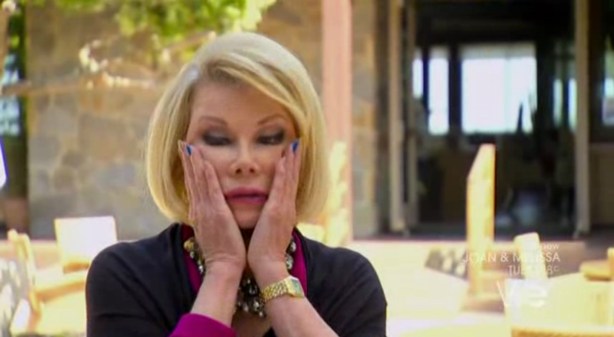
Celebrity Contrast Nails: Joan Rivers and Sharon Needles

Well, well, well this might just be the campest ‘Celebrity Contrast Nails’ post so far, with two inspirational figures from overseas recently championing the contrast cause.

Our previous heroes have included of course, Kelly Rowland, Serena Williams and Cher Lloyd.

Now obviously these days you can’t so much as get on the underground without spying a contrast nail nestling somewhere, BUT that doesn’t mean we shouldn’t keep our eyes peeled, as the gruesome saying goes, for the next big thing…

The next big thing for Joan Rivers seems to be the contrast nail being the ONLY pass-remarkable nail. Why paint ten when you can paint two? A thought-provoking look, and unquestionably a time-saving one. After all, this is a woman who constantly jokes about her proximity to death. We can see why she would opt for this.

4/10

We can’t score highly because at the end of the day, we all know this doesn’t pack much of a punch. But it makes sense. And if you’re only painting two nails, all the better that they be in this classy shade of blue which is both electric, but still dark enough to go with anything. She knows what she’s doing.

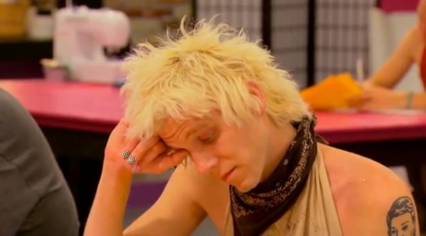
Now the VERY interesting case of Sharon Needles’s manicure. This is the man who is almost certainly about to win drag queen reality competition RuPaul’s Drag Race. Sharon seems to have taken inspiration from the pink, and black’n’white check that has long characterised the promotional shots and opening credits of the show. And, indeed, so did we. A long time ago.

Now we’re not saying Sharon has had a bit of a google and copied Best City Nails.

But stranger things have happened.

As we (very generously) awarded our own original RuPaul nails a slightly ridiculous 7/10 it seems only fair Sharon gets a solid

7.5/10

As she has swapped the pink and the check round, so the check is more dominant – as well as it being a finer design.

Just like Joan Rivers, Sharon has thought practically about this; unlike my experience over the past week or so of gong around with garish Easter nails, these colours will go with all the looks she has to do in the course of an episode without her nails ever looking unkempt. It’s a win/win (and she will probably win).

Our main criticism is that they could stand to be a fair bit longer, in case they need re-purposing as a weapon of self-defence against the poisonous, childish, boring, and slightly racist Phi Phi O’Hara.

THE SHADE OF IT ALL.

Week #18 – Springtime nails

For our Easter nails we have gone for two nails decorated with patterns inspired by ones you typically find on springtime confectionary packaging, some Easter bunnies, some daffodils, and a Christian cross in springtime colours, to remind us of the sacrifice of Christ.

I am constantly amazed by the triumphs and challenges nail art presents. You would think that the white rabbit or the daffodils would be, by some margin, the trickiest nails here, and yet these designs have produced strong results, and the straight-forward looking crosses are the wonky villains letting the team down.

Sorry, but I haven’t included any instruction or photos of different stages because there’s too many techniques involved when every nail is different.

Click on image for ludicrous HD.

9/10

We’re quite proud of how these have gone, and may have even gone for a rare 10/10 score if the crosses were a little neater but unfortunately we were hurried just as were finishing those two. Not 100% sold on the gold swirly fingers, either – I would never have done a design like this if it weren’t inspired by Easter eggs, and there is a brown to purple Powder Gradient which is not as visible as hoped.

But Best City Nails is not about perfection – it is about spirit.

May the true spirit of Easter be with you this weekend.

“And he saith unto them, Be not affrighted: Ye seek Jesus of Nazareth, which was crucified: he is risen; he is not here: behold the place where they laid him.” – Mark 16:6

Week #17 – My square-tip hell…

Oh hi there, welcome to Best City Nails, your one-stop shop for making the best of your bargain basement nail art products.

My last post featured Liv Fontaine‘s pink square-tips with gold and black, so we have attempted a tribute with Best City Nails stapes; glitter, contrast nail, and – more recently – masking tape.

Awarded a healthy

7.7/10

…the main things I have learnt from these nails is the powder gradient WITHIN a masking tape stripe, executed poorly on the right thumb (my actual right hand, but to the left of your vision) but really quite ok on the left contrast nail.

The glitter is not done justice in this well-lit close-up, but in normal life and particularly in the evening these clumps of glitter are a bit more dazzling, which accounts for a fair portion of the score.

Also very taken with lurid pink and greeny-yellow BUT are these nails a bit 2nd wave Nu Rave? And if so is that OK?

But by far the BIGGEST lesson I have learnt is

Square Tips are a Nightmare…

…for natural nails. Square-tip acrylics are one thing, and one day we might just have to go there.

But square-filed natural nails crack SO easily in comparison to their pointed/almond-shaped rivals. As in, the CORNERS (which you otherwise don’t have) snap off all the time, without you noticing, to leave a diagonal, literally like cutting the corner of a piece of paper. Which is very dispiriting if you wanted a row of ferocious fake-looking angles and have to gradually watch them chip into meaningless neither-here-nor-there shapes.

Also I am told, a lot sharper. Whatever.

We’ll soon be making the transition back.

Nail Street Style #4 – California Dreaming

So it isn’t street style in the strictest sense, but we thought we had to put up our dear friend, artist Liv Fontaine‘s first foray into the world of pro nails.

Liv, who is 22 and from Southhampton, sent this picture in all the way from San Francisco, and we can see why.- these nails are glorious, like fireworks across a pink sky, and certainly fit for a scandalous gutterslut Queen! YOU GOT SOME MONEY FO ME?!

Even though we’re trying to steer clear of the acrylics slippery slope, we’re pretty jealous of these.

Stay tuned for further thoughts on the very current – and I might add pretty controversial – topic of square tips.

Week #16 – Sticker Stencils

These were the first time I used some tips stencils I got for about 10p on eBay. When it was just the green with a white tip it looked way too Christmassy, so I had to add the blue, and then decided to do the black (some of which was just easier to do freehand).

Here is what some of the used stickers look like, stuck on my laptop.

I decided to set off the dominant stencilled nail with the blue ones (on top of which was applied dabs of pink Barry M powder, gold spots, and then a sort of drunken white leopard print).

6.4/10

I do feel the blue, pink and gold slightly floral nails go nicely with the stenciled ones.

The former are actually quite twee and look like they could be a print for an old woman’s shirt, whereas the others are quite sporty and tacky, which is a great contrast. However I am unhappy with the length, they are currently far too short. Plus let’s not lie they could be a fair deal more exciting.

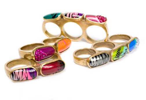
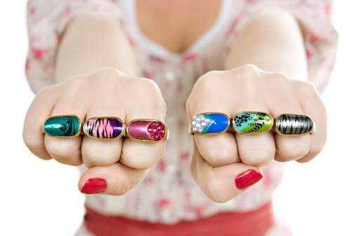
A Feast for the Eyes: Nail Art Knuckle-Dusters.

You know when you never realise there’s something you *NEED* until you see it?

NAIL ART KNUCKLE-DUSTERS. Oh my goodness, yes.

Here’s some sickening nail jewellery inspired by our fave nail diva Kid Sister, by  ‘contemporary art jeweller’ Islay Taylor.

How great are they?

You’d have to have your own nails good enough to match though. Otherwise it would be a bit like when really average-looking people think it’s a good idea to wonder about with Kate Moss (or similar) on their tops.

I mean what is this saying, really?

Anyway they don’t appear to be for sale but Islay if you want to sling some Best City Knuckle Dusters our way, we won’t put up a fight, and they sure would look better!

Here’s the glorious video where it all began:

Week #15 – Lion Queen

This week I was creating an eye-catching look for a music video. There is a powder gradient, with a zig-zag stripe and a text-focussed contrast nail. I am quite pleased with the ‘Lion Queen’ nails, having not attempted text before.

The inspiration for Lion Queen is the phrase ‘Lion King, Lion Queen’, which means a cross between ‘easy come, easy go’ and ‘swings and roundabouts’, expressing a jolly type of apathy.

Above you can see the white stripe painted over the yellow and red, and the blue details are starting to be filled in with a striping brush.

8/10

These nails look great in real life, and I love the crown, etc. I much prefer the yellow and red fade to the green and purple one, however (and I wouldn’t have changed except for the yellow was running out) – also the keen-eyed nail fans among you will have noted that the blue zig-zags on one hand look great, whereas the orange zig-zags on the other hand are less intricate, which is due to the orange pen being shit, and the blue pen being quite great.

Week #14 – Disaster Strikes

Yes there have been some severe nail art setbacks, significant breakages. But now I have set the standard of honesty I am soldiering on and letting you grimace at process. The dream is now long square tips like KID SISTER. Here’s some short, some medium, mostly kinda square, raggedy cuticles…eugh it’s basically a war zone.

This was achieved with a lurid yellow base, then Barry M ‘Dazzle Dust’ and ‘Fine Glitter Dust’ in blue and pink. Then white zig zags with a gloopy old striping brush, and gold glitter applied to blobs of wet nail varnish and scruffily circled in eyeliner. Apply a coat of Seche Vite, and despair.

4.9/10

They are kind of fun, and the housemates are into them, but the disparity in nail lengths and sloppy execution really holds this one back.

A bad week.

Dark times.

Enough to make you want to go back to writing about Lana Del fucking Rey.

Popstar Nails: The Del Rey Square Tips

THE LOOK

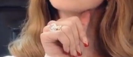
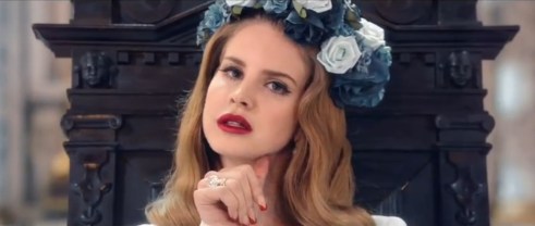
Throughout the Born to Die video Lana Del Rey features a very acrylic-looking square-tip, with a V-shaped red at the top, giving a conventional design a very slightly sinister edge. In luxurious attention to detail, the red tips are separated from the neutrally-coloured nail with a sliver of gold.

THE MEANING

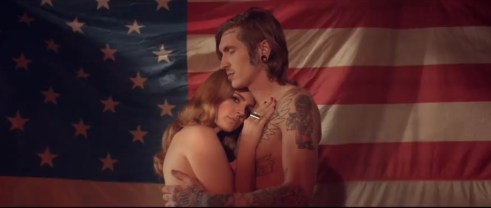
As the video begins in an embrace (the couple’s relaxed, tender, NAKED pose perhaps suggesting post-coitus) you might be forgiven for interpreting Lana Del Rey’s crimson-tipped talons as bloodied claws, dug into the skin of her partner during the freakiest throws of intercourse. This would sit well with the passion/pain duality in the song’s lyrics, which draw more from themes of mental darkness and physical death than one usually sees in popular love songs.

I believe it was the Marquis De Sade who said “It is always by way of pain one arrives at pleasure,” Madonna who said “There’s a certain satisfaction / In a little bit of pain,” and Lady Gaga who put it “And when it comes to love, if it’s not rough it isn’t fun.” So there’s a keen Pop tradition of exploring the sexual pain/pleasure relationship.

But Del Rey is an artist people seem be taking very seriously. In her choice of nail art perhaps she is not investigating the dynamic of pain in sex, but the more fundamental one of life and death. The French have an idiom that describes the orgasm as ‘le petite mort’ – the little death, and it is easy to expand a savage, animal sexual encounter, involving pain and the expenditure of life force, into Death at one end of the equation and, of course, a possible conception of new life at the other. The ‘blood’ on Del Rey’s nails therefore can be seen to encapsulate the paradox of the song’s title Born to Die.

It is not only in life’s creation that we may see a painful element, but in its preservation, also. The 1849 Tennyson poem In Memoriam A.H.H. contains a phrase often cited in reference to the cruelty and violence we can read into the evolutionary preservation of life: “Nature, red in tooth and claw”.

In fact, Del Rey introduces the Evolution Vs Intelligent design debate in the very first verse classically asking: “Is it by mistake or design?”

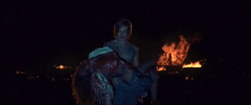
But the shock of Del Rey’s death at the close of the video over-writes much of this speculation with a new layer. How has she died? Was she really ‘born to die’ as she herself suggests, if so perhaps the earlier blood on her nails is her own, and it foreshadows her death at her own hands. Perhaps she mauls and tears at herself in a fulfilment of her destiny, and a completion of the creative process. Who can say?

THE VERDICT

We may have liked to see Del Rey’s nails in the throne scene a little more extravagant, perhaps even aping the splendour in tigers or the flowers that surround her, and contrariwise maybe a second less high-concept, standard nail bar look for the car scene would befit better befit the wayward but somehow all-American runaway couple.

But maybe this wouldn’t allow for the all the business about exploring sex, violence and the harsh realities of nature, and we all know that is what nail art is really for.

Nice going, Lana.

8/10

See the nails in motion below:

%d bloggers like this: